A well-meaning friend recently sent me a link to Ink Factory Studios (IFS), along with an excited text about these artists who seem to do what I do. She’d heard the buzzwords “engagement” and “visual aid” come out of my mouth before, and was excited to find a company where artists translate a company’s presentation into visuals. So, I visited the site and took a look around.
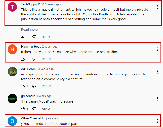
At first, I was actually happy to see that IFS was providing an answer to the often mind-numbingly similar animations that so many companies use to create “videos” that may as well be radio ads. Honestly, you can’t blame people for getting excited about the prospect of being able to “create animations” when there are companies out there that make it cheap or even free to do so. But as you can see from Moovly’s staff picks video the audience’s reaction is often mixed, at best:

Instead of clipart, IFS is providing custom illustrations to partner along with their presenter’s words. They’re also drawing the images live, so the figures are being illustrated as a human would actually draw something. This is an improvement over some auto-generated “illustration” engines which move in an awkward left-to-right, up-and-down format. It’s certainly miles beyond what other companies provide, if we’re comparing to the likes of Moovly. I have a lot of questions as to how the intake process for IFS works (for instance, if they claim to be able to illustrate complex ideas, do they correspond with their presenters ahead of time to ensure that their illustrations are appropriate to the topic?) but assuming things are nicely communicated and streamlined, it’s not a bad product.
So then I began to read the claims on their website.
Engage attendees at virtual and in-person events like conferences and trade shows.
Spark creative thinking and problem solving within your organization.
Boost clarity, productivity, and alignment in team meetings.
Ink Factory Studio Home Page
Okay… Let’s dissect this y’all.

Do Visual Aids Really “Add Engagement?”
I mean… sure? Yes, a combination of verbal and visual information is almost always going to be better-absorbed than say, a wall of text or a half-hour verbal seminar. That’s why PowerPoint was invented in the first place. But how far does that really take us?
In the example video for Puppetize Digital, Ink Factory Studios presents us with a problem they say they’ve solved: “How do you get attendees pumped for a virtual conference when they already spend all day on their devices?” Given that the keynote video was posted November of 2020, we can assume that their use of the term “all day” was well-chosen and accurate, since this conference took place during a global pandemic. IFS says they created a welcome video after users had registered, “as a way to engage them with all the conference had to offer.”
The video has animation, and text, but that’s about it. There’s no narration for these elements, there’s no elements which prompt the attendees to click through the conference website and truly see all the content the conference “had to offer.” We’re depending on learners to remain on this screen and watch this video for the minute and a half it takes for the video to run its course. Now, if the conference attendees are anything like most of us who’ve worked from home over the last year, they know there’s nothing to stop them from getting up to make another cup of coffee while this thing plays out. If the video still only requires learners to read the content, then is it really much better than a static web page?

I Don’t Think “Engagement” Does What You Think it Does
At the very bottom of the page, IFS states that “Animation brings illustrations to life” and proports to elevate any presentation to the “next level.” University of Illinois states that “You can use animation to focus on important points, to control the flow of information, and to increase viewer interest in your presentation.” This is very true! Our eyes are attracted to motion, so as you populate animated elements onscreen, in order, it draws your learners’ eyes to the right spots. But that’s not what IFS claims. To follow the marketing on their example page, any animation creates so much engagement that it solves the problem of keeping learners’ attentions long enough to complete an entire virtual conference. If the keynote alone is an hour long, one can imagine the conference itself spans several hours or even days.
Can the presence of animation really create these results? Rather than breaking down the substantial amount of research on animation and its use in presentations. I’ll throw out a couple links here:
- B2B Decision Labs breaks down a 44-person study they conducted on the impact of adding animation and annotation into a 9-minute PowerPoint presentation. They found that learners “were more excited and engaged when viewing the presentation” that contained annotations and animation.
- C. J. Daly, J. M. Bulloch, M. Ma, and D. Aidulis analyzed 54 students and state that “…while increasing student satisfaction, we do not find strong evidence in favor of animated images over still images in this particular format.”
- Baker, Goodboy, Bowman and Wright found that “…the technology of PowerPoint does not directly influence students’ learning. Rather, future research should reframe empirical investigations to focus on how instructors are using PowerPoint in the classroom to de-termine the pedagogical conditions under which PowerPoint is effective.”
- 80% of students under Mary Katherine Zanin self-report that “learn better when animations are included”. You can view the article here
So just from these three samples, we can see that learners at least like animations, even if they’re not conclusively proven to help absorb or retain much information. It sounds like B2B Decision Labs and Mary Katherine Zanin put a lot of work into designing their animated PowerPoints to hone in on specific elements that help their learners engage with their content… But just the presence of animation isn’t what makes the difference here, a good educator is.
The rest of IFS’s claims also fall to the responsibility of the person running the presentation. A good presenter can ask questions that “spark creative thinking” and check in with their audience to “boost clarity,” but the images onscreen aren’t what prompts that kind of engagement with learners.
What’s the Harm?
So, okay, animation isn’t the magical answer to creating great learning content, but it’s certainly not hurting anything. Why did I just devote several hundred words into debunking poor Ink Factory’s claims? Well, it’s all got to do with money. If a company spends their hard-earned cash on cheap “engagement boosting” tactics like this, one of two things will happen:
- The company takes a “good enough for now” approach. This is better than a still PowerPoint presentation or an email, and learners seem to like it well enough, so the company stops looking for better solutions. And the problem is that the learning experience could be so much better; learners deserve so much better.
- The company doesn’t see the results it wants, and loses trust in methods that really work. After trying one or two exciting new tools that claim to boost learner engagement and information retention, any smart company will test the results. And without a good educator behind the cheap visual aids, the results are likely to be inconclusive. Not seeing how a good learning organization makes any difference, the company stops trying to improve the learning experience at all. This leads to silo’d information, lack of cooperation between departments, and any number of other nightmares.
The second method is the real danger here: If a company isn’t willing to support its people with the proper tools, then education (and employee performance) quickly falls by the wayside.


