Building Scenarios
Any ID knows that a training product should strive to get as close to the learners’ experiences as possible. 9 times out of 10, when I get a training request that has to do with any kind of human interaction, I’ll end up scripting out some scenarios.
I don’t need to go into why scenario-based learning is valuable, because there’s a lot of literature out there that covers the topic very well already. Suffice to say, the closer you get a training to the actual experience, the better, because it gives learners a place to safely explore their options.
Before I start scripting, I’ll find out what learners are currently doing that created a need for training in the first place. I need to know what mistakes learners are making, so that I can give learners the opportunity to make those same mistakes in the training. That way, we can safely let learners make mistakes, and course-correct.
And then I’ll get an order for a compliance-based course.
Compliance Courses
Compliance comes with its own special challenges. After all, this department is around to make sure the organization obeys the various laws that govern it. Depending on your industry, your learning products may even be audited by those governing bodies to ensure that you’re training your people correctly. So, it’s understandable that when I’m consulting with a Compliance stakeholder, they’re looking to come out with a training product that’s air-tight, with no room for mistakes or misinterpretation. However, this turns a scenario with options to create real teachable moments into more of a slideshow. Let’s look at the first and second versions of the training below as an example.
V1 RESPA Section 8 Supplemental

V2 RESPA Section 8 Supplemental

In the second version of the training, the only thing you’re asking learners to do here is read. Sure, it breaks up the dreaded Word Wall, but it does not stimulate the brain or add any meaningful interaction. But Compliance doesn’t want to have a complicated interaction. The first version of this training has a branching dialogue scenario that could lead learners down the wrong path for several slides. That’s horrifying to a Compliance Officer. If you’re not immediately correcting the learner, then most stakeholders with “compliance” in their job description aren’t going to want a training with any room for mistakes. And sure, we IDs know that there are ways around this problem, but it’s still VERY hard to convince your Compliance department that this is okay to do. After all, we have design degrees, not legal ones.
False Scenarios
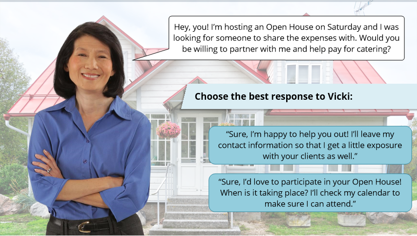
This is our answer. Compare the first two versions of this training to the image below: you may notice that the outcome of each choice leads to the same non-violation of RESPA.
Proposed RESPA Section 8 Supplemental

Where the first version of this course offered opposing choices (attend or do not attend the Open House), this version offers learners a choice that does not conflict with the law (do not attend the Open house and do not cater, OR do attend the Open House and agree to cater). These buttons would both lead to the same slide, saying something like “congratulations for making the correct choice, here’s why you can attend and cater an Open House to promote your business, but cannot provide catering service (a thing of value) for someone else’s event without attending, blah blah blah. [insert legalese here- you get the point, I’m not a lawyer].”
So if both choices lead to the same slide, why is it important? Why bother to build it?
Because your learners don’t know how this eLearning is built. They don’t necessarily know what choices in their course have consequences, but they’re feeling pressure to pay attention and get these answers “right” because they don’t know what the company is tracking, or how it may add up to their score at the end of the eLearning (again, this is regardless of whether you’ve programmed consequences: Your learner doesn’t know what you have). So, this is a way to get learners to use their brains, to engage with the content, without giving them the opportunity to actually fail.
You’ll notice I made sure those dialogue boxes are phrased differently. This is to increase the illusion of choice with our learners. In true JRPG dialogue-box format, the instructions tell us to choose the BEST answer. Most learners will suspect that one answer will lead to a different, more favorable outcome based on its subtle phrasing.
Am I counting on some learners to be a little unobservant? Is this just a tad bit confusing? Sure.
But let’s face it, the average learner isn’t paying attention. Most of your learners are moving through this eLearning in their second window in between meetings or spreadsheets. To assume they’re devoting their full attention to it is naïve. And for the truly curious learner who wants to know what the difference is between these answers, simply give them the opportunity to retry the scenario. They’ll be able to see that the same outcome happens with both buttons, and that’s okay. That’s their treat for being curious, a little peak behind the eLearning curtain.
So our learner wakes up juuuust a little bit, and chooses one of the options. Then, both options lead to the same following slide, which explains the regulation more fully, and covers both scenarios (what happens if they do or do not attend). Is this a perfect learning experience? No. But does it beat the heck out of a wall of text or a locked-animation read-only slide? Yes it does! And not one Compliance Officer had to take a Tums while implementing it.

