I’ve updated a number of slide decks for different training classes, TED Talks, webinars, etc. For this post, I’m going to focus on the two biggest staples: PowerPoint and Google Slides.
When it comes to building slide decks, there’s a few guiding principles that I follow:
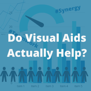
- Avoid content overload by minimizing the number of words on the slide. Keep each slide centered around a single idea.
- In keeping with the advice above, I’m a fan of the 5/5/5 rule: no more than five words per line of text, five lines of text per slide, or five text-heavy slides in a row.
- Blank space is your FRIEND. Cramming a slide full of content will cause learners’ eyes to slide off the page so they can take a break.
- Use graphics effectively. Make sure they’re relevant to the content, as well as the branding and style guides of the organization.
- Make sure the contrast between your words and background is readable. I recommend Coolors’ contract checker for this.
Before-and-after examples:
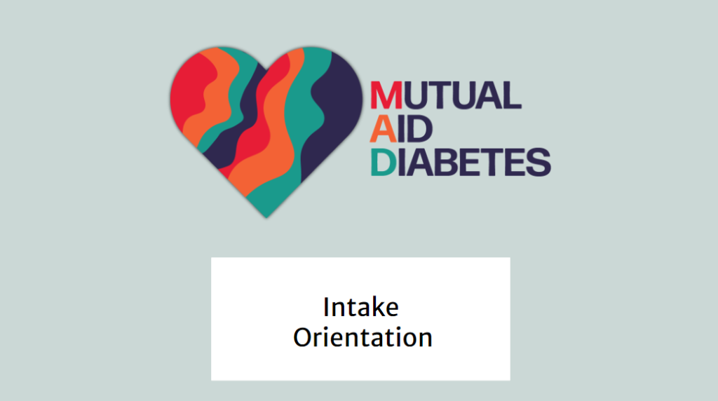

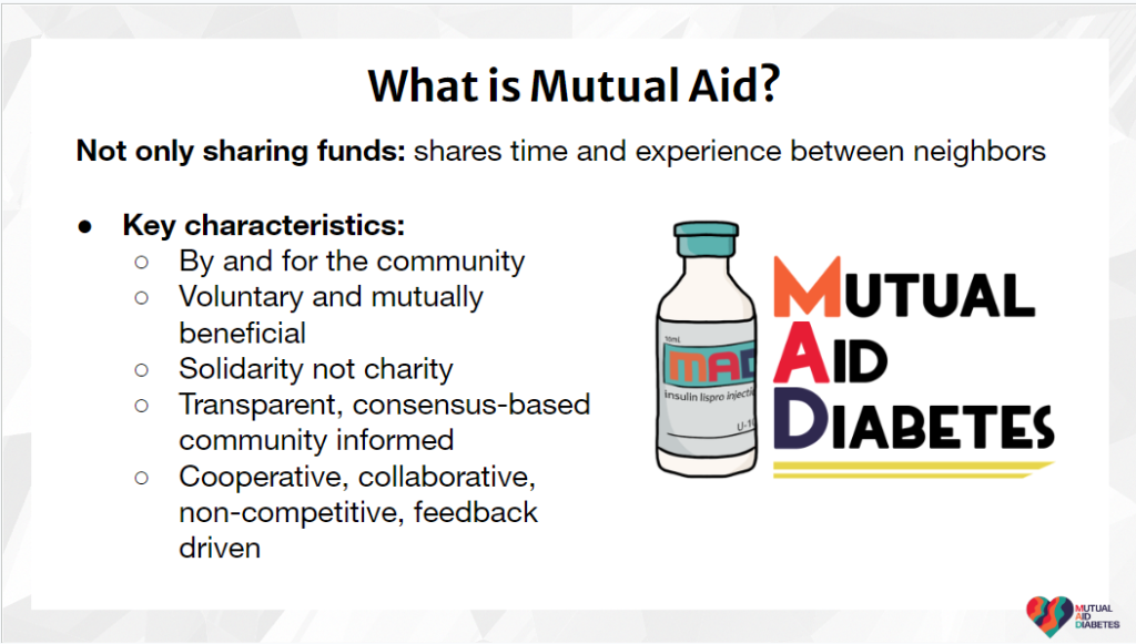
Design & Aesthetics: The first slide was the first title slide for Mutual Aid Diabetes. It is informational, but it boxes out each element and does not allow for hierarchy of information.
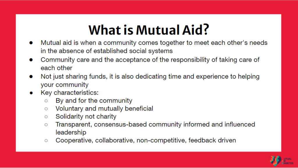

Information Overload:
To address information overload, I enhanced the original slide (highlighted in red) by reducing text density. This onboarding class was formatted much like a lecture, with a single expert passing on knowledge to the volunteers. In order to add engagement to the class, I prefaced the discussion of mutual aid with a question asking for learners’ prior knowledge on the subject, to gauge their existing knowledge on the subject. Subsequently, I presented the relevant information through a concise bullet-point slide. For facilitators, detailed notes were thoughtfully organized in the “speaker notes” section of the PowerPoint file, ensuring seamless delivery of the content.
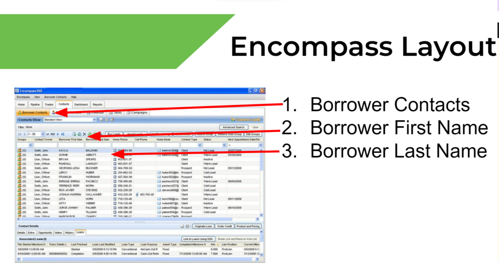
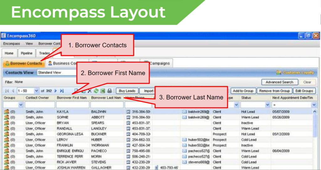
Screenshots: These images represent a reconstruction of the initial PowerPoint presentation on the Encompass Home Loan system, reflecting the caliber of work typically executed in my screenshot projects. Whenever feasible, I prioritize enhancing the quality by capturing screenshots using advanced software like Camtasia or Snagit. This approach not only ensures higher visual fidelity but also involves an expansion of the screenshot to spotlight only the most pertinent features, contributing to a more comprehensive and polished presentation.